It’s now been more than 3 months since I first got hands-on with and reviewed Hubbl. For those not familiar with Hubbl, it’s one of Australia’s newest services that combines a hardware and software experience.
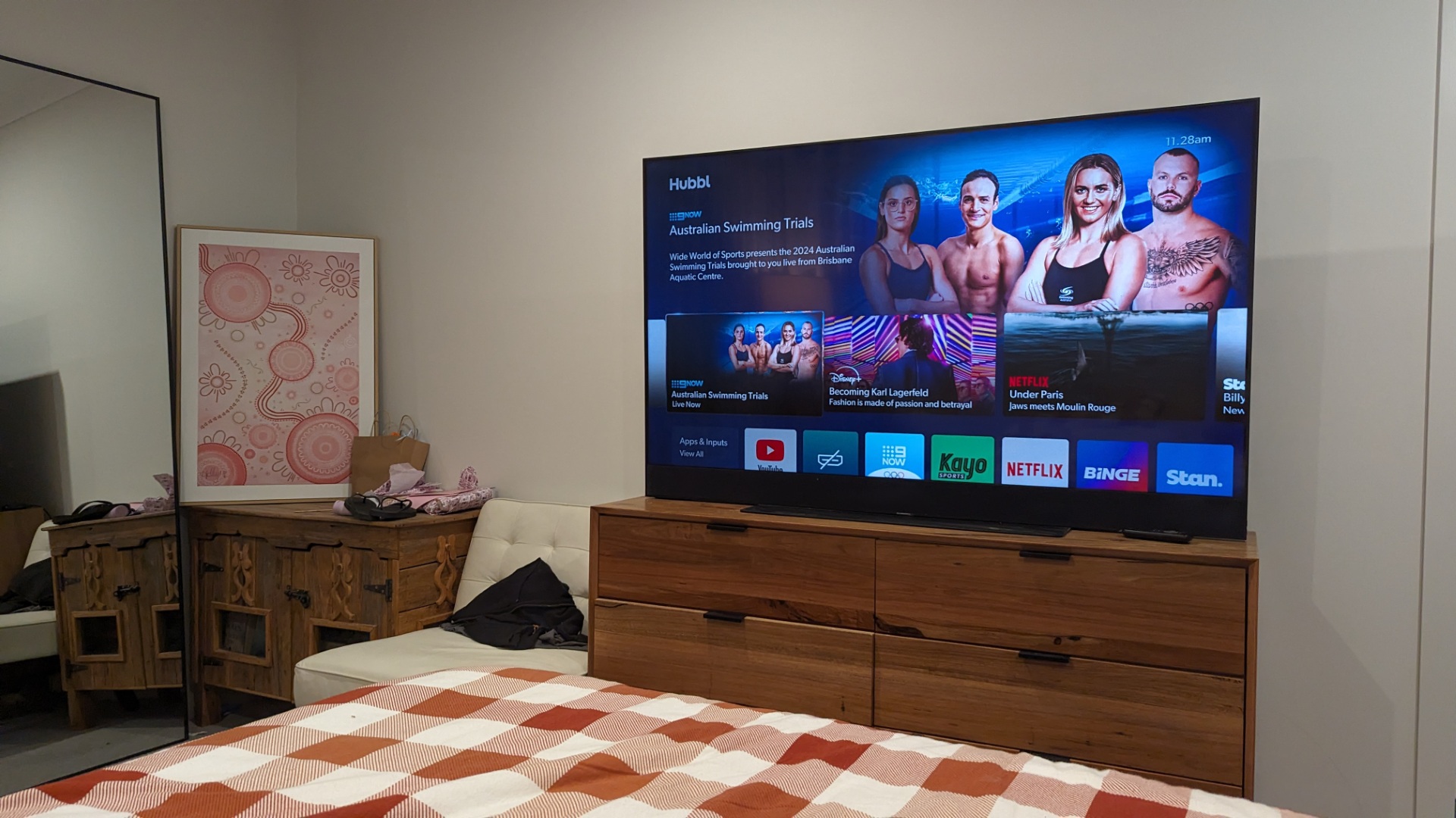
Hubbl is offered in 2 hardware options, the first, being Hubbl Glass, a TV that comes in 55″ or 65″ sizes and a range of colours, along with a Hubbl Set top box, which can connect to any HDMI input.
Unfortunately there’s no web-based or mobile-based version of Hubbl, something I think they definitely need to add, given many of us sit on computers much of the day and would love to consume streaming content while we work. As we live our lives and are moving about the world, being restricted to hardware at home, rather than having access on our mobile phones from anywhere, feels particularly restrictive.
Regardless of the hardware you choose, the experience is very similar. The big idea here is to put content first, rather than rely on users remembering which of your favourite TV shows and movies are available from which app, a choice made harder by the growing list of streaming services.
On this front I think Hubbl has had modest success. If I reflect on my time with Hubbl, there have been a number of times where I have gone to the specific app like Netflix to access the content. If Hubbl’s content-first approach was truly successful, I’d be asking for them to remove the list of apps completely and the dedicated buttons on the remote to Kayo, Binge, Netflix would be completely redundant.
While the UI of Hubbl is fast and looks pretty, the organisation of content rows needs work.
Amazingly there is still no way to hide content rows from services that you don’t subscribe to (i.e. you can’t play), so why are they locked to your home screen. This feels like a very anti-consumer decision, and much more about commercial arrangements with content providers to feature their tiles as an on-ramp to obtain subscribers.
If I compare this to the Xbox UI, where almost completely home screen customisation is possible, the two are worldly apart and Hubbl has a big opportunity to improve in this space.
I have enjoyed the feature row of content tiles that changes week to week, this makes the experience feels fresh and if I was Hubbl, I’d lean into this in a big way. It would be nice to see a blend of what’s popular or being promoted on the platform, and the genre’s of content that an owner is into. For example, a Game of Thrones promotion for someone who hates that genre of content is likely to annoy, while recommending the latest F1 coverage to a Formula One fan would be seen as a big positive.


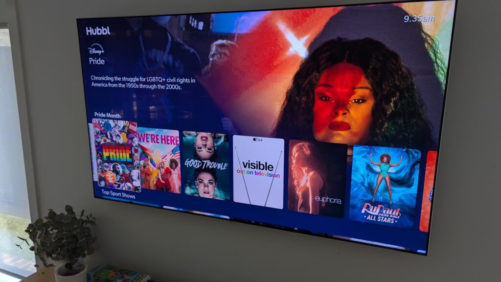
Right now there’s a content row for Pride month, which for some will be welcome and personally doesn’t phase me, but for others will not sit well with them, depending on their political views.
The point here is that to power the best experiences, Hubbl needs to learn much more about it’s viewers. Given there’s going to be multiple viewers of a TV/STB across a household, over the course of any given week, it’s important to be able to rapidly switch between profiles and unfortunately that’s still app-based, rather than OS-based.
Sure, if a child attempts to access a piece of mature content, they will be prompted for verification through a pin code etc, but the process of selecting content, the app launching, then selecting a different user profile and having the content reload is all a little cumbersome and something that should be rethought.
If you have real app integration, Hubbl should allow users to build Hubbl profiles, then pass that through to the app that houses the content.
One of my favourite discovery techniques is the trending section of the UI. What isn’t clear to users is how this is determined. Is it a rollup of the trending content information from inside apps like Netflix, or is it simply content view counts from Hubbl users, this should be clear and an improvement would be to let users choose which they’d like to see, along with content filters for apps they subscribe to.
Speaking of changes, or lack there of, in the 3 months since launch, there’s been much written about Hubbl and while I expected a number of software improvements, there really hasn’t been any which is massively disappointing. If you want adoption for a new platform, then key to that is listening and responding quickly to feedback. Instead, what we’ve seen is Hubbl cut the price of their STB by 20% and $200 off the Hubbl Glass.


The 3 months of free trials I received really makes you rationalise how much you’re paying (or about to pay) and just how much value you get from each. While Hubbl offers discounts to combine streaming service payments through them, they never quite got to 100% penetration here, with a couple of exceptions meaning you still have some bills off platform. The discounts I found were a nice bonus, but are unlikely enough to be a meaningful drawcard for most users. For the streaming services, they rely on their content driving subscriptions, so there’s not great motivation for them to offer further discounts.
Overall I’m really impressed with the Hubbl Glass hardware, the visual and audio sound quality from that display I couldn’t be happier with. The thickness and weight are unlike any other display on the market right now, this makes moving the display between rooms (which I did a couple of times) far more difficult than necessary. The display could technically be wall-mounted, but I’m not sure I would given the weight, and the look you get from wall mounting a sleek, thin display, just isn’t achievable here.


I would recommend most try the OTA box for Hubbl if you’re interested as the price point is far more approachable. The UI and the remote are identical, with the only differences being the integrated audio, and the integrated microphone that allows you to issue voice commands from across the room.
We’ve seen the introduction of just 1 app since launch, Stan and as far as smart TVs go, the support for streaming app services is pretty good, it just lacks any sense of gaming, or browsers that most smart TVs offer. The final issue is the lack of support for casting content from your devices to Hubbl wirelessly, with Chromecast and AirPlay or even WiDi pretty broadly adopted, this feels like a strange omission.
Overall I think the ambition of what Hubbl was trying to achieve was fantastic, much like the Boxee Box back in the day, but unfortunately this is let down by the execution and lack of responsiveness on software updates. This simple can’t be set and forget.

